Remember the old phone game where you matched brand names to their logos? It was amazingly easy to recall corporate logos you have no relationship with, and yet you see as a consumer almost every day. But from small businesses to the largest-mega brands, good design techniques can make your brand elements recognizable and memorable.
Consistency
In this day and age, there are so many creative ways to incorporate your brand elements into all of your content. Providing the same look and feel throughout not only creates consistency, but establishes professionalism and organization.
As humans we crave structure and, despite what some may think, rules. Defining these in your brand guidelines will create a smooth process for presenting and viewing your company.

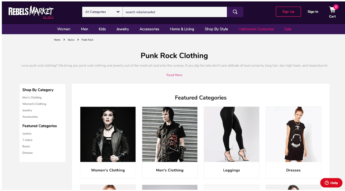
Despite the “anti-establishment” agenda that comes with being punk, this website is surprisingly aligned with a pre-established grid system.
Significance
Your “Brand Identity” should reflect your company values as a whole. On top of the shape and meaning of your logo and brand elements, there is historical and cultural context in the colors you choose. Awareness of that context is important when aligning your values. For example, if you are a small business owner selling natural soaps, a bright neon green might not be suitable for your brand.
While a groundbreaking tech and streaming company like Spotify might be able to pull off this unnatural green, and even become famous for it, it’s important to note what colors can signify to a consumer, and when it’s appropriate to use them.
Knowing the latest trends in terms of color choices can make your brand feel up-to-date and aware, but maintaining steady brand guidelines that cater to your audience will ensure customer reliability when new trends come in and old ones die out.
Accessibility
Whether working with a team of internal graphic designers or an acquaintance with the latest version of Photoshop, having accessible and consistent brand guidelines will set you up for success.

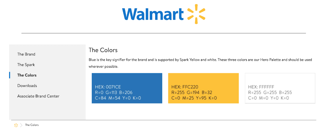
As the #1 employer in the U.S., Walmart’s brand elements are widely known and recognized. Could they have gotten there without having public HEX codes? Who knows!
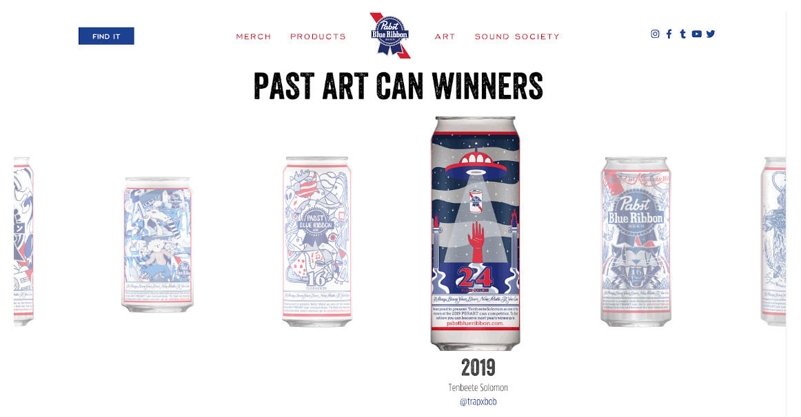
When you have time tested identity, it’s fun to bend the rules while still feeling cohesive. Pabst Blue Ribbon may be the beer of college folk but they roll with it in a fan fueled art contest, putting creative and wacky designs on cans, while still sticking to their classic fire-engine red and blue-ribbon blue.

From Pabst Blue Ribbon’s website.
We know how important brand colors are because we’ve incorporated them into hundreds of videos. We love to work with companies to tell their stories using their iconic colors.
How can your brand identity stretch farther?

Using Clarifi’s Brand colors to explain loan basics.


