In 2021, the abundance of digital advertising is vast. We have never been able to create so much, so quickly. Access to video editing is more commonplace (hello, TikTok), and VR apps like Adobe Aero can place 3D animations in your living room. Many brands have taken advantage of the hyper-speediness of content, and have commissioned artists and designers to push these technologies forward.
But with the speed and ease of creating content also comes the feeling of not being able to get away. Forbes states, “Digital marketing experts estimate that most Americans are exposed to around 4,000 to 10,000 ads each day.” On top of that, we’ve all seen ads that “just don’t get it” or haven’t “read the room.”
Don’t be that guy! It is possible to balance your branding priorities, AND be conscientious about ad fatigue. Here are five trends that showcase what 21st technology can do in fun and focused ways, without being obnoxious or overwhelming.
Multi-functional Color Palettes
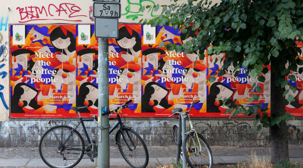
Once your brand color palette has been established, consumers are able to identify your brand. Extending your brand colors for certain campaigns and projects can break up the monotony and give your brand a voice and tone, instead of just a “look.”
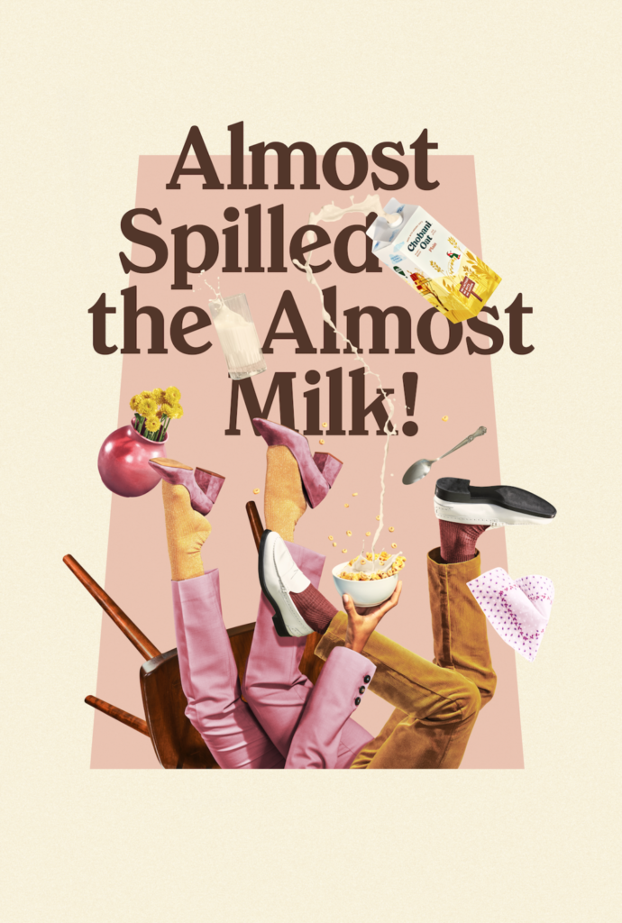
Chobani has been synonymous with many brand shifts – this recent campaign is an offshoot of their pastel color palette, with a more muted, retro feel.
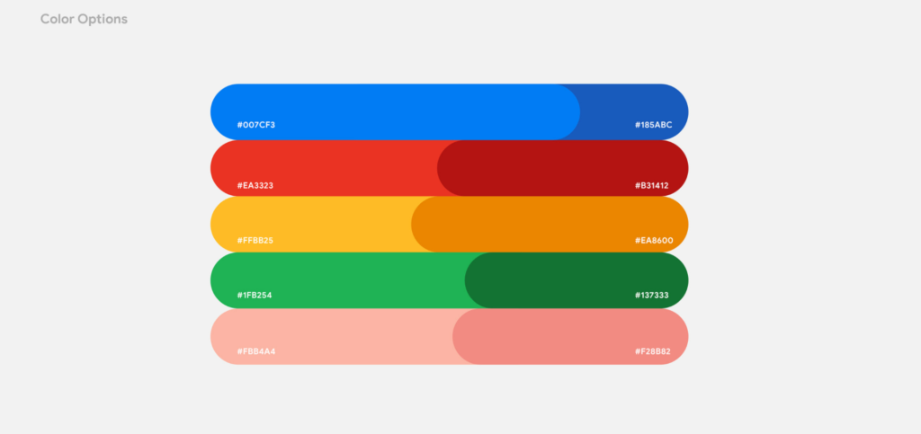
Colors for a Google Pixel ad. Google’s highly recognizable primary colors are given a breath of fresh air with the addition of pastel pink – what’s different about this product?
Colors are also becoming richer – we’re fading out of the pastel-everything fads and jumping back in to bright pinks and blues. Bright, expressive colors draw people in, and even more “serious” (finance, academia, etc.) industries are committing to vibrancy.
Sustainable Marketing
When promoting your brand, it’s important to be conscious of your impact – visually and environmentally. The climate crisis is here, now. Before investing in wasteful packaging or print materials, let’s ask ourselves “Is this necessary?” “Is there a better way to do this?” Short answers: Probably not, and probably yes.
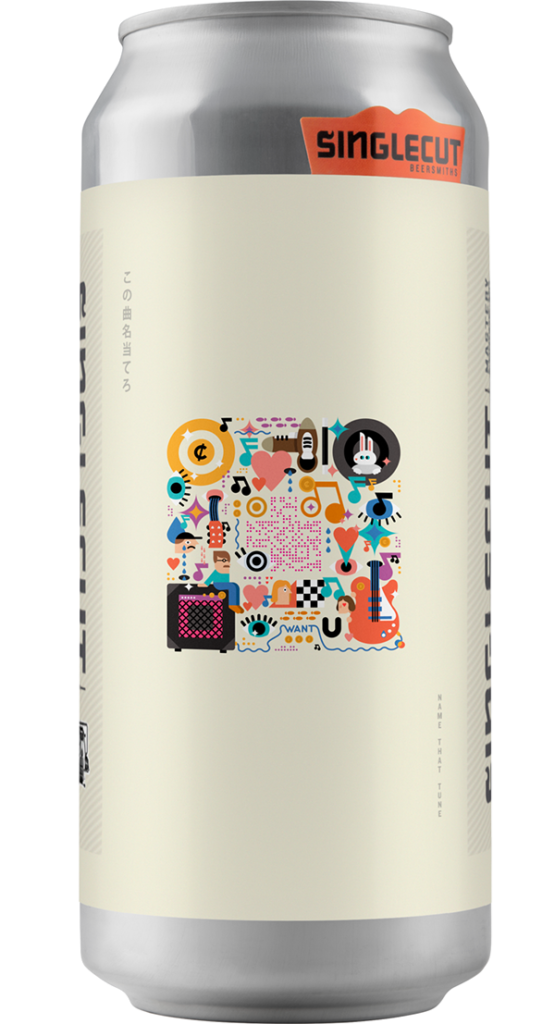
Sustainable branding can be thought of as a design challenge instead of a constraint. QR codes are a great tool that have become commonplace, with digital menus and no-contact user experiences.
Not only is sustainable branding good for our world, it’s more attractive to consumers. Knowing that a business is considerate of their impact aligns with consumer values, and seeing waste in packaging can be off-putting and can even incite anger.
From Finances Online:
“88% of consumers believe companies can influence societal change (GSG). Thus, they should take the lead in addressing environmental issues by providing more sustainable products. Plus, shoppers nowadays are more conscious about what they purchase. They make it a point to opt for more sustainable brands whenever they can. In fact, 23% shoppers are now willing to pay an extra 1% to 5% for sustainable products (Statista, 2019).”
How can you incorporate the digital world to lessen the amount of paper and plastic scraps that are eventually thrown away?
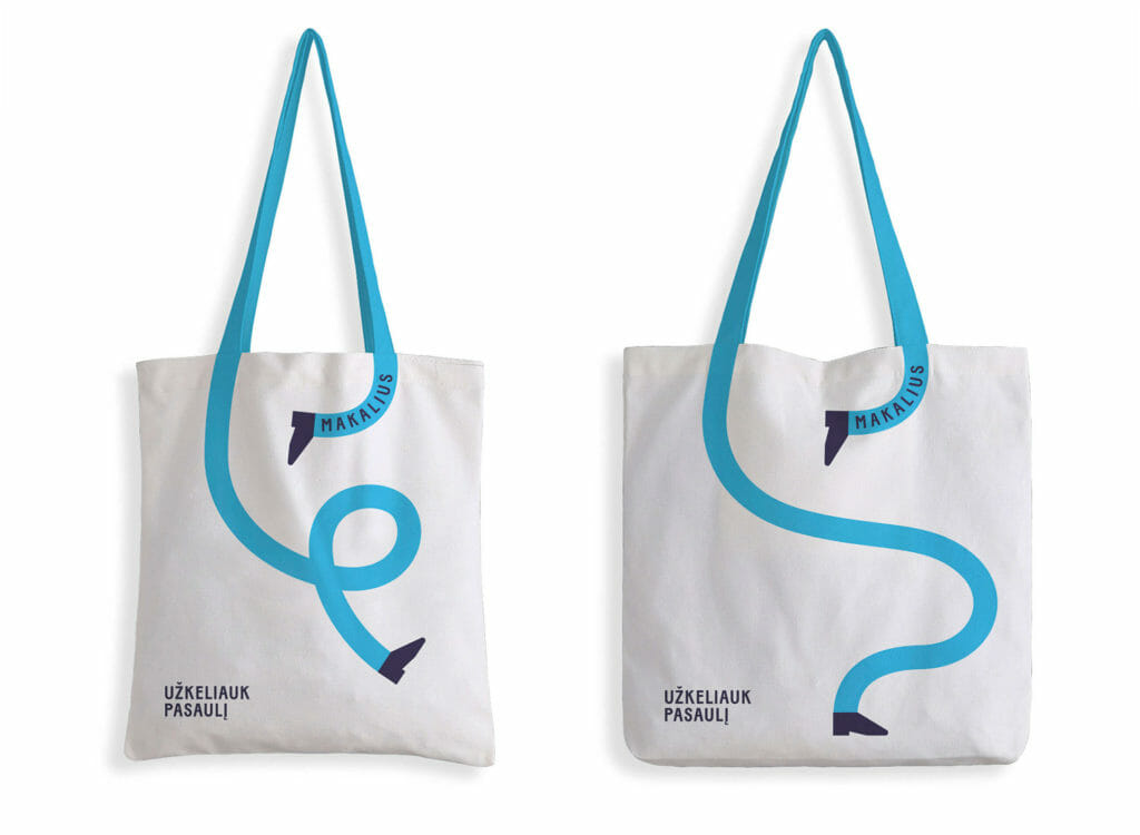
Clever use of tote-bag branding for a travel agency in Lithuania – what are other ways to reduce the impact of plastic and make your visual impact last longer?
Gifs!
Motion is one of the greatest attention – grabbers, and can draw people in to your website, spice up your social media feed, or be used in ads. And a great bonus – they don’t require as much work as a full-length video. Some of the most effective gifs are pretty subtle in movement, but communicate an original idea in a fun and engaging way.
View this post on Instagram
View this post on Instagram
View this post on Instagram
Illustration
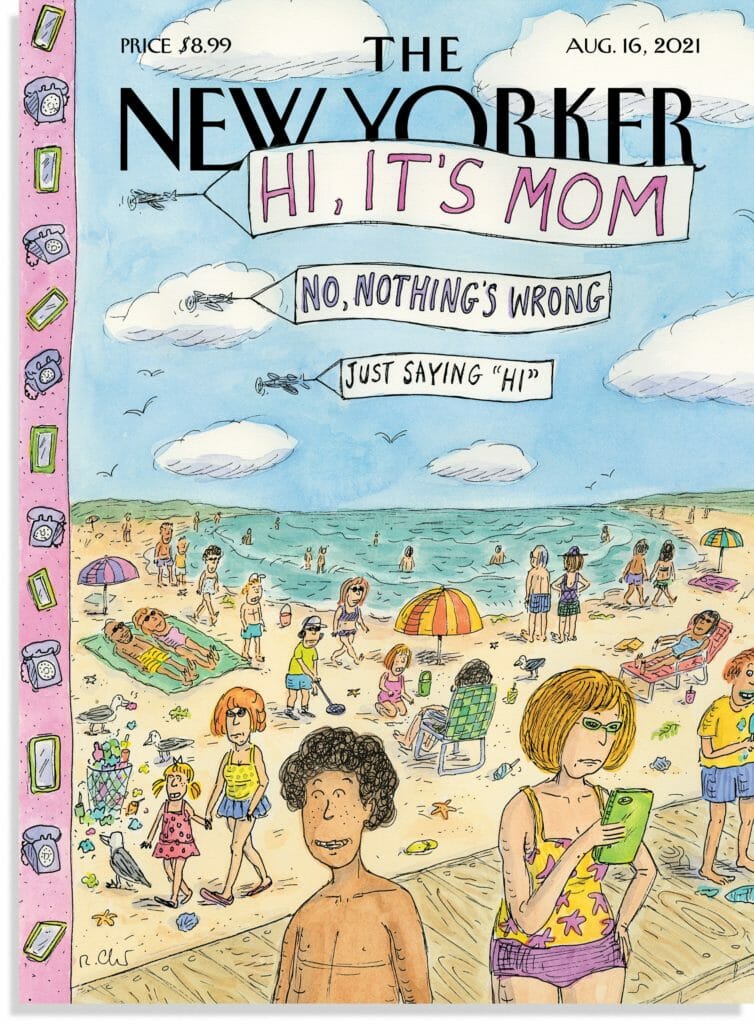
The right drawing can often communicate more than a page-full of copy. Get to your message quicker with illustrations that can accompany video content, slide decks, proposals, you name it. And this isn’t limited to pen and ink. Digital drawing allows for faster animation, if you’re thinking about that in the long run.
Take Your Logo to the Next Level
1. Make it Multi-dimensional
Your logo should be able to work on any surface. Developing versions that work with unexpected colors or backgrounds can save frustration in the long run. And that’s not limited to a literal sense. Think about what forms your logo could take, and how it could be translated into a concept, like Hinge’s ad for “the app that’s designed to be deleted.”
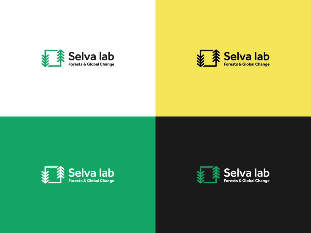
Selva Lab Logo variation from Hyphae

Minnesota Environmental Fund Logo Variation from Next Day Animations
2. Make it Animated
Animated logos are a fun way to express the feeling and mood of your brand identity. Think of all the places your animated logo can be used – in video content, email signatures, on your website, and in your social media profile.

Uptogether Animated Logo – animated by Next Day Animations
There are a multitude of branding trends that are catchy, fun, and take advantage of what technology can do to show off your brand. But it’s important to think about your branding goals and objectives before jumping on the bandwagon. What strategies will work best to tell your brand story? What is most important for consumers to know?
Need help figuring out a brand strategy? Curious what your options are? Give us a call and we’ll help you figure it out.

